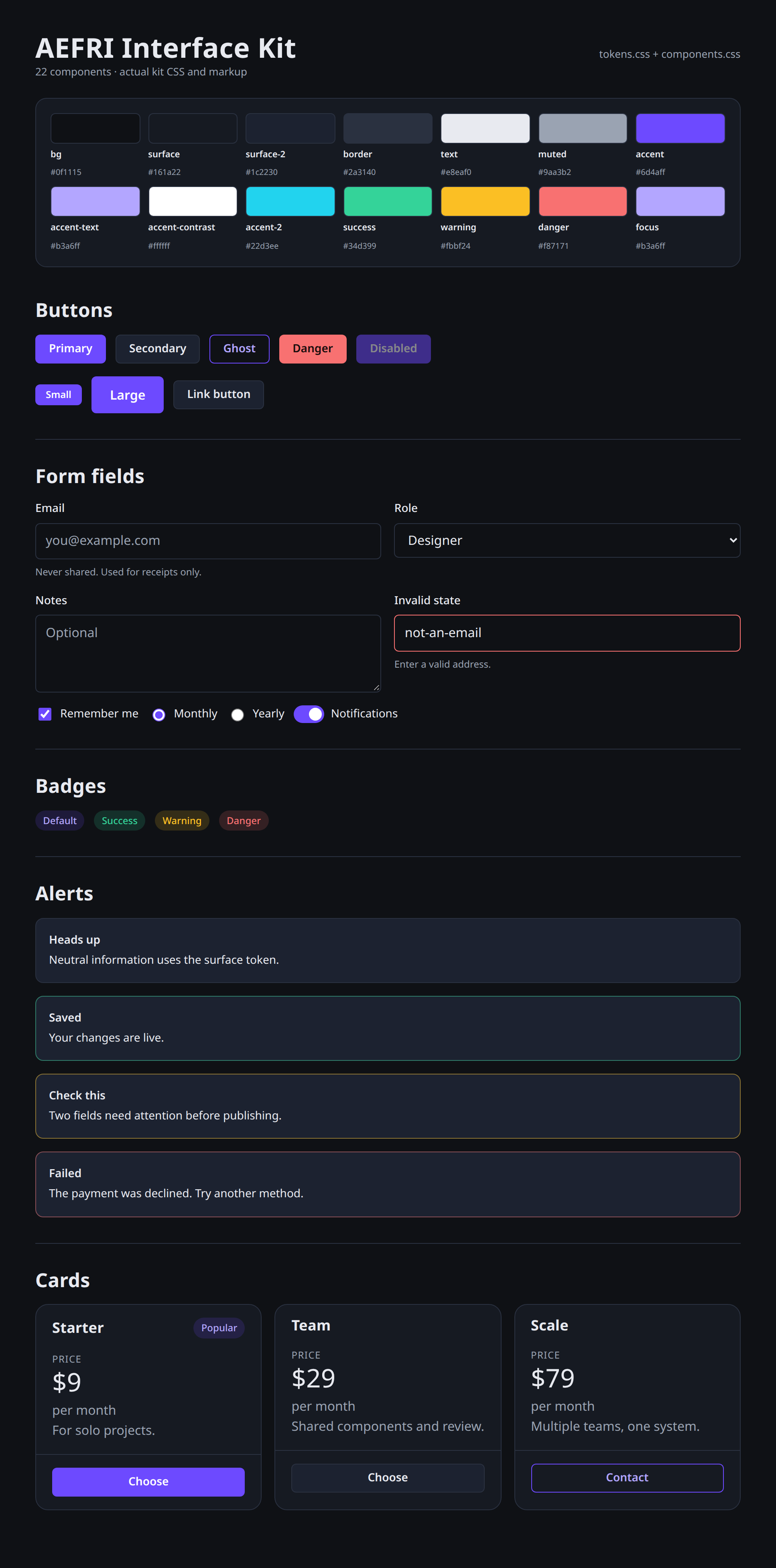
A framework-neutral UI kit: design tokens, a base layer, and 22 documented components in plain CSS. No build step, no dependencies, no JavaScript.
You receive 8 files:
- tokens.css - every token as a CSS custom property; dark by default, light via data-theme="light"
- base.css - reset, typography, focus ring, reduced motion
- components.css - 22 components: buttons, fields, checkbox/radio/switch, badges, alerts, cards, stats, tables, tabs, breadcrumbs, pagination, avatars, tooltips, modal, toast, progress, skeleton, empty state, navbar, footer, keyboard, layout utilities
- components.html - full demo of every component with a theme toggle
- preview.html - the curated gallery shown here
- tokens.json - machine-readable tokens for both themes
- tokens.scss - SCSS variables and maps
- README.md - quick start, class reference, measured contrast tables, accessibility notes
Measured, not claimed: every text/background pair passes WCAG AA in both themes; the lowest is 5.15:1 (button label on accent), computed at build time.
Honest note: this is framework-neutral CSS with semantic class names, not React or Vue components. You write the markup; the styling is done. The preview images above are renders of this exact kit, not mockups.
License: CC0 1.0 - commercial and personal use, no attribution. Free minor updates.
AI disclosure: this kit was written with AI assistance (an AI coding agent).